EXP 2 Final Submission
Blog Link:
Architectural Concepts:
The two concepts I'm working with for experiment two are, "Volumetric addition and subtraction" and "aesthetic lightness".
ElectroLiquid Aggregation Quote:
The addition and subtraction of volumetric spaces create a sense of aesthetic lightness.
Aesthetic Lightness
The idea of aesthetic lightness is one which deals with the beauty in simple structures which are airy and light but strong, or give the illusion of fragility without the compromise of strength. To implement this into my model, I've constructed a seemingly floating structure where the roof is in the shape of a leaf which allows for the station to stand without walls. This gives the space freedom and a connection to its surroundings by removing those spatial confines so that it can breathe and give the user a more sensual experience.
Drawing inspiration from Zaha Hadid's train station where the curvillinear element has a special relationship with the way it touches the ground, I tried to make the roof of my modelbrush the ground surface, creating a visual lightness to the structure. I was also inspired by Glenn Murcutt's architectural principles of sustainability where structures should "touch the earth lightly" literally and metaphorically by using more timber and stone in my model.
Volumetric Addition and Subtraction
Through repeated superimposing, intersecting, and removal of volumes one can manufacture new and interesting spacial interactions. I chose to combine transformations of static and rational rectangular blocks along with circular geometry which by themselves emanate stability and give a sense of centrality. The circular segments along with the straight angular forms create variety and give a sense of motion to the space.
I used face to face contact of volumes and interlocking volumes in the seating of my model to create an architectural space that seemed to have just occurred naturally. The seemingly random and organic nature of the rectilinear addition and subtractions of the seating areas are in horizontal linear forms enhancing procession and movement to encourage commuters to move into the waiting space.
Sustainability
The curved roof mimics water droplets rolling off the tip of a leaf, whereby rainwater falls of the roofing. The circular pipe line running down the centre of the structure transports water collected from the roof catchment area to an underground reservoir where it can be filtered and reused. The glass water pipe can also function as a simple water feature. The sunlight pours through the glass circle on the roof to light up the light rail stop in the day and the solar panels use the energy generated during the day to power the lights for night time.
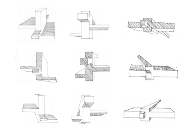
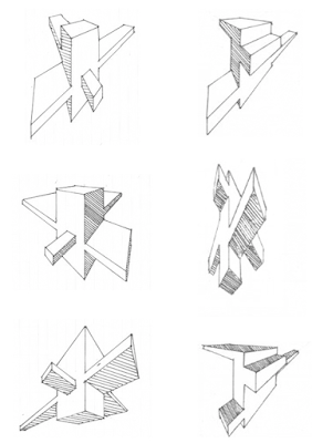
18 Parallel Projections
Chosen Parallel Projection:
36 Textures
Chosen Textures:
Light Rail Model
CONTEXT & SCALE
Leaf-like structured roofing that has solar panels and caved-in water catchment area
ENTRY VIEW
NIGHT VIEW
Leafy walls that help give structure to the open plan of light rail
Applying the light texture on the adjacent to the balustrade draws attention to the volumetric addition and subtraction used to create the visually light stair railings, by repeating similar geometries.
LIGHT RAIL TRAINS TRAVELLING IN BOTH DIRECTIONS
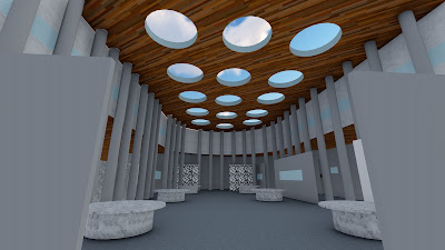
The water-collecting glass segment of the roof allows natural light to fill the space.
The medium texture is applied to the recycled water fountain above the timber seating. This patterned creates a nice contrast against the natural materials used so that it stands out amongst the earthy tones. The use of diverging lines in the texture help to draw our eye up and across the space to create an aesthetically pleasing decorative touch.
SEEMINGLY FLOATING ROOF
CLOSE-UP VIEW OF CEILING AND INTERIOR
The dark texture applied to the grassy vegetation/tree seating areas is a stark contrast to the natural/manmade materials, allowing it to break up the space and keep it modern and lively. The texture is composed of intersecting circles which reiterate the volumetric transformations used in the nearby seating/tree pot/fountain arrangements.
SEATING ARRANGEMENT & 'NATURE WALL'
Nature infused waiting space
SEATING CREATED FROM ADDITION AND SUBTRACTION
Sketchup Model


